farm city!
10 photos.
1 Comment


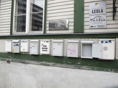
I can’t tell if this is kind of cool or kind of cheesy or both. I don’t really care. A few cool photos came out of it…
“10 photographers. 10 photos each. All taken on 10/10/10.
A single day represented in 100 photographs.
No special occasion, no big event, just the essence of daily life captured through ten lenses.
The 1010 project was devised as an antidote to everything in modern life always having to be bigger, better, louder and brighter than what’s been before.
It’s an opportunity to slow down and appreciate the simple, everyday things that make life beautiful.”
See the other 90 photos here.
empty pools.
Leave a Comment
“Frontside grinds on real coping, carving tile, sessions with friends and lots of cold beer.”


A few weeks back, I came across a neat little magazine made of newsprint featuring a bunch of photos of empty pools and people skating them. I can’t remember what it’s called, but I liked it. And then I found Poolrider, a site dedicated to pool skating. There are hundreds of photos and these are only four of ’em. Something cool about the re-imagination of space. The appropriation of abandoned or underused places. I’ve never cleaned up an old pool for skating myself, but it seems like something I might want to try…
trapped.
Leave a Comment
Cecil Day. Printmaker. Nova Scotia.

“In Traps, her most recent series, she looks to the subject of hunting in developing a suite of etchings that illustrate, to scale, traditional traps—box traps, snares, leg irons—alongside their related quarry.”
This is the only print from Day’s latest series that I could find, but I was lucky enough to see the entire series at the Art Gallery of Nova Scotia during the recent Nocturne: Art at Night event in Halifax. You can see some of her other work here.
art history.
Leave a Comment
Slavery. Graffiti Crew. The Subway Art History Project.

Joan of Arc, a reimagination of this work by Seen.


Another reimagining, this time of work by Dondi.

Finally, another work in tribute to Blade
See the whole slide show here.
“A collective of graffiti writers who have embarked on an unusual citywide campaign to summon 50 or more of the most famous pieces of old-school graffiti out of the history books and back onto the streets. The project, called “Subway Art History,” is unusual not only because the artists are making the pieces with the permission of businesses, schools and other perhaps nostalgic owners of blank vertical space, but also because of the nature of the pieces themselves. They are expressions of homage in a subculture that has almost always been defined by fierce competition, intense striving for originality and a kill-the-elders attitude toward the past.
…In New York the idea is to use the pieces to try to teach a two-part history lesson. The first is about the glories (as the collective sees it) of the early days of graffiti and the invention of a vernacular art form that has swept the world. The second lesson is about world history itself, in neighborhoods where education remains low on the list of priorities for many struggling teenagers.”
I recently came across the 25th anniversary edition of Subway Art, a collaborative photo book by Henry Chalfant and Martha Cooper. It’s large format and the photos look great. I especially appreciate Cooper’s photos of works-in-progress, portraits of artists themselves and just her general ability to capture the context of the early graffiti scene in New York.
Anyway, the Times article quoted above, features recreations of work by artists featured in Chalfant + Cooper’s book.
Tags: Blade, Dondi, graffiti, graphic design, hiphop, Seen, street-art, subway art history project, urban life
papertype.
Leave a Comment
Shaz Madani. Designer. England.


Shaz Madani’s Arctic Paper work is neat – instead of creating typefaces for printing onto paper, she creates the type out of paper. Her other work, more traditional printed matter, is cool too. You can check it out here.
Tags: craftsmanship, graphic design, paper, papertype, printed matter, Shaz Madani, typography
gastrotypographicalassemblage.
1 Comment
Lou Dorfsman (with Herb Lubalin and Tom Carnase). CBS Building. 1966. New York.


Gastrotypographicalassemblage is a 35 feet by 8.5 feet tall work of art designed by Lou Dorfsman to decorate the cafeteria in the CBS Building in New York City.
Dorfsman designed the work for the building’s cafeteria, using varied typefaces to list all of the foods offered to patrons in hand-milled wood type. The project was ultimately completed in 1966 with assistance from graphic designer Herb Lubalin, and Tom Carnase, who crafted the typography from Dorfsman’s original design.
CBS removed the wall from the cafeteria in the 1990s, but there is currently a movement to restore the wall to its previous glory by the new owners, the not-for-profit Center for Design Study in Atlanta.
Tags: craftsmanship, Gastrotypographicalassemblage, graphic design, herb lubalin, letterpress, lou dorfsman, typography, wood, work


