farm city!
THEN // NOW
1 Comment
Patrick Cummins. Photographer. Toronto, ON.


100 Adelaide St. East, 1989 & 1998.


140 Boulton St. 1988 & 1998 & 2004.


515 Queen St. West, 1984 & 1999 & 2011.
Patrick Cummins started taking photos of Toronto architecture in the 1980s and has documented the ever-changing cityscape. There are thousands more photos on Patrick’s flikr here. He has a book in the works & I look forward to getting one for my coffee table.
Tags: architecture, Patrick Cummins, photography, Toronto, urban life
TRAFFIC ISLAND
Leave a Comment
The city is a nice place you always think about escaping…
By klisterpete and akay.


High in a rocky tree-covered area between two busy highways, a minature Swedish summer cottage painted traditional red with white trim suddenly appeared. Of course, it didn’t actually appear, klisterpete and akay carried it up there. They built the red picket fence to surround the tiny grassy area. They hung the clothes line across the yard. They brought the promise of the swedish countryside everyone wants to escape to, right into the middle of the city. They took an unused, unappreciated space and made it a charming and peaceful place of wonder despite the traffic below, the train passing on its tracks behind, buildings stretching out farther behind those…
What if more people made the places they ARE the places they WANT TO BE? It’s not so hard.
-kidpe
>>>I found out about AKAY from V.
Tags: AKAY, architecture, craftsmanship, graffiti, street-art, urban life, wood
abandon me.
Leave a Comment
Numi Thorvarsson. Photographer.


Haunting photos, abandoned homes, Iceland (I think).
See the rest here.
streetstyle.
Leave a Comment
HYURO. Graffiti. Street Art. Valencia, Spain.

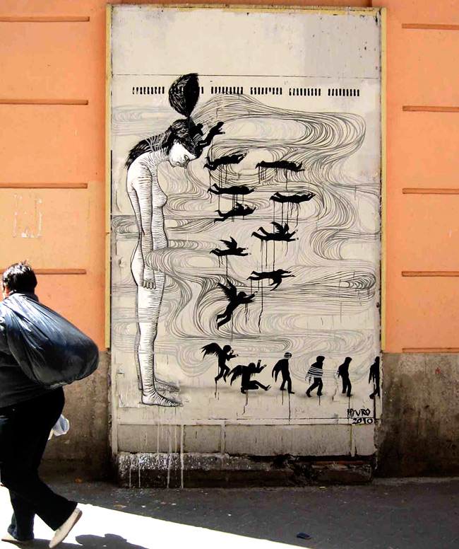
 ”
”


black & white steez. lines, flow, women, nature – HYURO got into it by collaborating with escif, one of my favourites who i blogged about here.
now, any graffiti masters wanna take me under their wing, show me the stuff?


On My Mind:
Leave a Comment

Nick the Tailor; ‘love’; Nanook; Gaia; city-heart.
Tags: architecture, Gaia, graffiti, graphic design, Nanook, Nick the Tailor, tattoos, urban life, wheat paste, women
flow.
1 Comment
Herbert Baglione. Graffiti Writer. Artist. Brazil.


Baglione makes cool art. A lot of the stuff I’ve seen by him is on paper, but these are some of his works on walls and in public. The graffiti-debates continue in Toronto these days, spurred on by a suburban Mayor who is out of touch with the urban core of the City. It’s making me excited for spring & the new work going up.
Tags: architecture, graffiti, graphic design, Herbert Baglione, street-art, urban life
lend a helping hand.
1 Comment
overunder + No Touching Ground. Graffiti. Wall Art. Wheat Paste. Brooklyn, USA.
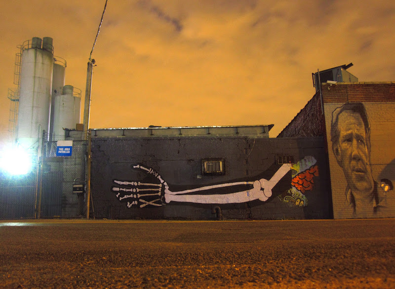
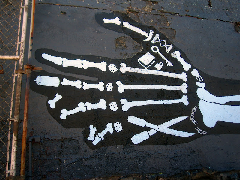
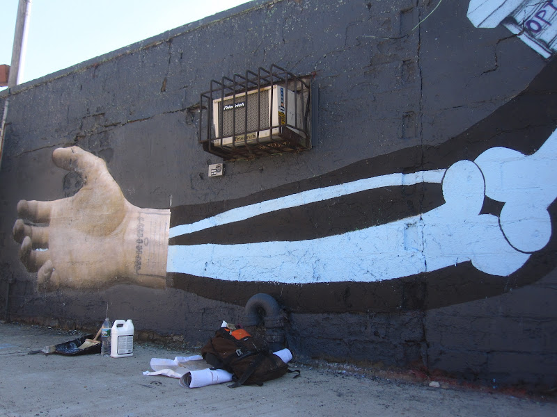
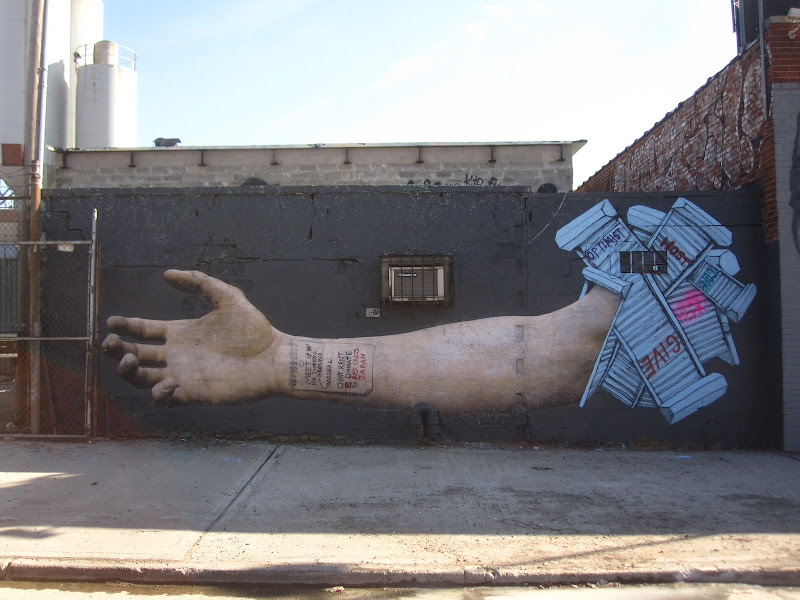
An interesting wheatpaste / paint mural combo. Playing on the notion of paper as an ephemeral medium (when pasted out-of-doors, especially). Over time, the piece will disintegrate but also introduce a new mural.
I like this idea. From overunder, who also seems to be responsible for my favourite blog / project idea of recent times – blogcabinbrooklyn.
Tags: architecture, craftsmanship, graffiti, graphic design, posters, printed matter, street-art, urban life, work
considering the gravity of stuff.
2 Comments
escif. Graffiti. Street Art. Murals. Valencia, Spain.


escif is prolific as fuck. check out hundreds of large-scale pieces here. I’m really into the style and the subject matter – a mix of natural motifs, portraits and architectural elements.
Tags: architecture, craftsmanship, escif, graffiti, graphic design, mural, street-art
Leave a Comment
Paul Gustave Doré. Artist. Engraver. Printmaker. Illustrator. French. 1832-1883.


I found out about Doré at a recent trip to the Art Gallery of Ontario. There, currently, an exhibit featuring a lot of work by David Blackwood – one of my favourite Canadian artists/printmakers is on display. Blackwood lists Doré as one of his influences. It’s easy to see why – the maritime motifs, dark, haunted matter, insane details.
Back in the day when most published novels were complete with beautiful woodcut engravings or finely detailed illustrations, Doré was a famous name. He illustrated scores of novels in the mid-1800s for Lord Byron, Cervantes, Poe & Milton. The top three images shown are from Coleridge’s The Rime of The Ancient Mariner, one each from The Divine Comedy and Little Red Riding Hood. His portrait appears last – ain’t he handsome?
Tags: craftsmanship, graphic design, Gustave Doré, printed matter, sailors, wood, woodcut
